Data wizard
Add a metric
Use this procedure to add a new data series metric (data series).
- On the Data tab, click Add New Data.
-
To update the metric, click the ellipsis button in the
Metrics column.
A list of previously published metrics appears.
- On the list, select the metric to add.
-
Repeat the preceding steps to add as many metrics as necessary.
Note You can add a regression metric to see how it visually correlates with the metric that you need to forecast. For more information about regression metrics and regression analysis, see Regression metric. Also, see Use a regression metric (sample workflow) for details on using regression metrics.
Delete a data series
To delete a data series, click the X at the far right of that data series row. The data series is removed from the chart.
Change the display name of a data series
You can change the Display Name in relation to a specific chart or for a particular series. It is reflected in both the legend and tooltip. The original name of the metric is not changed.
- In the Display Name column, click the text to change.
- Type the new display name.
- Press Enter or click outside the box to confirm the display name.
Applying a transform filter to a metric
Dashboard Designer gives you the ability to easily transform or filter data. Use the Filter by Dimension tab to define the data that a metric aggregates and show only the data points you are interested in. With the Use Historic Data and Special tabs, you can show historic data values, data as a percentage change, or a cumulative value to compare historical data with current data.
Filter by dimension
Use this procedure to filter by dimension. You can use the Data Series pane to update the display name for the chart to reflect the purpose of the filter.
-
For the data series to filter, click in the space under the
heading
Transform/Filter.
An ellipsis (…) button appears.
-
Click the ellipsis.
The Transform/Filter screen appears.
The Filter by Dimension tab is shown by default and all dimensions associated with the metric are displayed.
- Under Select value(s), select from the list to display values for the dimension.
-
Select the box for each value you want to select, and click
OK.
To undo the selected values without using a dimension as a filter, or to select all values, click All/Clear.
- Repeat the preceding steps until you have all of the necessary dimensions and filters.
- Click OK to close the Transform/Filter screen, and then click OK again to view the chart with filtered data.
Transform data
Using the Transform/Filter function, your chart can display historic values, show data as a percentage change, percentile rank, or show a cumulative value. You can also compare historical data with current data. This function is particularly useful when comparing past and present performance.
- In the Data Series panel, click under the Transform/Filter column, and then click the ellipsis button.
-
In the
Transform/Filter
window, click the
Use Historical Data
tab.
Here, you can shift the time frame for this data series relative to the time set for the chart.
-
Select
Use historic value by
and enter an
Interval value, such as
1 Month.
Using this example, the data series will show the value from one month before the time set for the chart. You can define one data series that does not use this option and a second data series that uses the option to shift the time back, for instance by one month. The two lines on a line chart show the values for the currently selected time and for 1 month earlier. This approach provides an easy way to compare the current period with one or more previous periods.
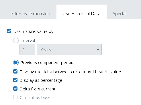
Calculation algorithm
Selected check boxes when the historical period is set (either as an interval or as the previous component period)
Display the delta between current and historic value
Display as percentage
Delta from current
Current as base
Current data minus historic data divided by the historic data.
Yes
Yes
Historic data minus current data divided by the historic data.
Yes
Yes
Yes
Current data minus historic data divided by the current data.
Yes
Yes
Yes
Historic data minus current data divided by the current data.
Yes
Yes
Yes
Yes
- Optionally select Display the delta between current and historic value, which shows the metric value difference between the current data and the historic data calculated as the current value minus the historic value.
-
Optionally select
Display as percentage.
-
When selected without Display the delta between current and historic value, the new value is represented as a percentage of the old value.
-
When selected with Display the delta between current and historic value, the percentage represents the difference between the current and historic value.
-
- Optionally select Delta from current to show the difference between the historic data and the current data calculated as the historic value minus the current value. When this check box is selected without Display the delta between current and historic value, it has no meaning.
- Optionally select Current as base to have a ratio to the current data. When this check box is selected without Display as percentage, it has no meaning.
-
Click the
Special tab and select
one of the following ways to display the metric:
-
Display and select the option: Percent of total or Percentile rank.
-
Cumulative Value
-
Trendline
-
Moving Average
-
Summary
Note A percentile rank indicates the percentage of cases in a frequency distribution below or equal a given variable value. For example, if your percentile rank for the examination is 78, it means that you performed better than 78% of other students. Percentile rank is calculated according to the following formula:PRx= (cl + 0.5*fi)/ N * 100%
where:
x - current metric value
cl - number of values less than x
f i - number of values equal to x
N - total number of values
-
- Click OK to finish.
Add metric to a group (filter group)
A chart or grid is often defined to listen to one or more Filter Groups using the Incoming Actions properties of the component.
Another approach is to set Filter Groups in the data series definition within a component’s data properties. This way, you have the ability to specify that only part of the data series in a component responds to certain filters. In the Data tab, in the Groups column, you make the connection between the data series and the Filter Groups.
-
In the
Groups column, click
the ellipsis button in the metric row to filter.
A list of available groups appears in the Filter Groups window.
-
Select the box to the left of the group to add the data series
to the group.
You can add a data series to multiple groups.
- Click OK.
Change display color for data series
On a chart, you can customize the color of the data series in the Data Series pane under the Color heading. Select a color for each metric or let the colors be assigned automatically (the default).
-
In the
Color column, click the
ellipsis button for the data series to update.
A Colors panel appears.
-
Select a color preference:
-
Custom colors: Click a color to select it from the list.
-
Custom color: Select the option, use the vertical and horizontal sliders to create a custom color, and click OK.
-
Auto color: Select this option to enable automatic color assignments.
-
-
On the Specified Colors pane, you can assign a color to each
dimension value to achieve consistency for all dashboards in the project.
-
On the
Tools tab, select
the
Custom colors icon.
The Custom colors pane appears.
-
On the
Tools tab, select
the
Custom colors icon.
- Click Add to add a new title color.
-
In the
Title text box, type
the name of the dimension value to assign a color to.
The name appears in the list on the left.
-
Use the color palette to create the color for that value.
As you make adjustments in the color palette, your changes are reflected in the list, which is automatically updated.
- Click OK.