Create a demo chart
Use the following procedure to create a basic chart.
-
Create a new
View. Do one of the following:
-
On the Guide in the main panel, click Add new view.
-
On the Documents Tree, right-click View and select New View.
-
-
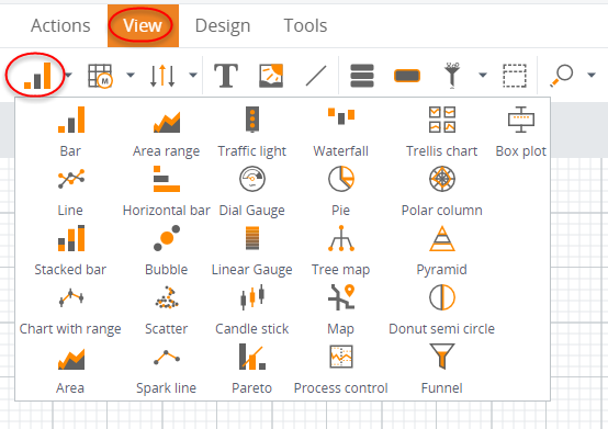
On thee View tab, click the small arrow to the right of the chart
icon to open a menu of chart type options.
-
Drag the Bar chart icon onto the canvas. As you drag the chart, a
dotted line appears to help you position the chart on the grid.
When you release the chart on the canvas, the wizard window appears with the Data wizard open by default. You can click OK now and return to it later.
-
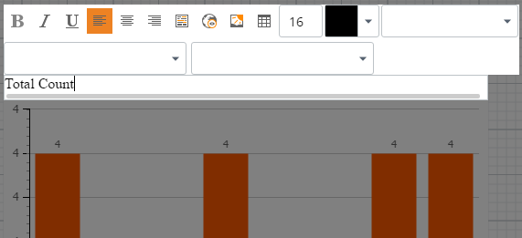
To change the display name, which will appear on your graph or
chart component, click the bar chart component once, and then click
 .
.
-
Click
Order Count and change it
to
Total Count. Click
anywhere outside of the component.
- The wizard contains the default metric. To change this metric, you need to configure the data series according to what is required. Click Add New Data and select the metric.
-
Open the
Time tab (Time wizard) to
set the time frame by clicking
 on the context menu on the
right. It allows you to specify a time interval and display the data associated
with that time interval, allowing your chart to dynamically load data depending
on the current dates and settings. For the purposes of this demo chart, we will
make the chart display
Total Count data for the past one year.
on the context menu on the
right. It allows you to specify a time interval and display the data associated
with that time interval, allowing your chart to dynamically load data depending
on the current dates and settings. For the purposes of this demo chart, we will
make the chart display
Total Count data for the past one year.
Select the Interval of option, and change the interval from Days to Years. Leave Order Count in the "To last available date of the metric" field.
-
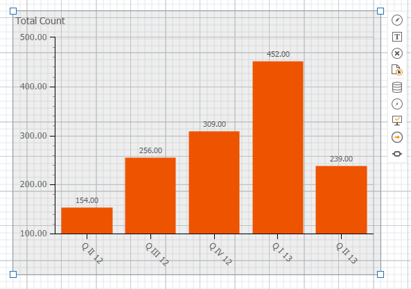
Click
OK. Your chart now shows
Total Count data for broken down for the last year.
-
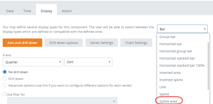
Open the Display wizard by clicking
 on the context menu on the
right. Display options allow you to present your data in the format most useful
for your needs.
on the context menu on the
right. Display options allow you to present your data in the format most useful
for your needs.
-
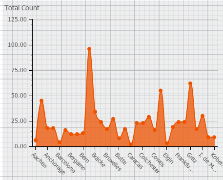
Click the first drop-down list to change the chart type. Select
Spline area. This chart
will now be presented as a spline (smooth curve) with its area shaded instead
of a line graph.
-
Change the X-axis from Year to ShipCity. It means that the data
will be plotted against city names rather than quarters. Click
OK. Now you can see the
total counts per cities.
-
Save
 your View.