Toolbar
Use the toolbar to perform the operations described in the tables.
|
Icon |
Function | Description |
|---|---|---|

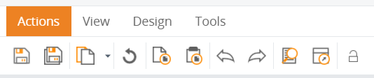
|
Save |
Saves changes on the current page. |

|
Save all |
Saves changes for all open documents. |
|
Recent items |
Opens a drop-down list with recently opened items. |

|
Refresh editor |
Refreshes the editor. |
|
Copy |
Copies selected element. |
|
Paste |
Pastes copied element. |
|
Undo |
Cancels the previous action. |
|
Redo |
Returns the previous action. |
|
Preview |
Opens a pop-up window with the preview. |
|
Open in Viewer |
Launches the Viewer. |

|
Change password |
Opens a screen where you update the password for logging into Studio. Available only to users who are assigned rights to change passwords. |
|
Icon |
Function | Description |
|---|---|---|
|
Studio settings |
Opens the Studio settings. |
|
Filter groups |
Opens the Filter groups window. You can decide what information goes to the different groups. |

|
Generate documentation |
Creates a comprehensive set of documents that specifically define your projects and dashboards, thus creating a backup for you. You can use this file as a reference in the future to recreate your dashboards if needed. |
|
Export |
Opens the export window, where you select which documents to export from the current project. |
|
Import |
Opens the "Select file for import" window, where you select a file to import. |
|
Import process |
Starts the process import procedure. |
|
Custom colors |
Opens a window where you can add a new custom color from the color palette. |

|
Resave all |
Resaves all the documents that are open. |
|
Validate document references |
Checks the validity of references. |
|
Publish |
Updates the Data database according to the document configuration. For example, use this option when you create a new, empty database. When you click Publish, the database is populated with all the necessary tables. |
|
Publish and rebuild |
Forces the Data database to the initial state (without data). For example, use this option when you need to reload all your data. Click Publish and rebuild and then load the data again. |
|
Generate localization tables |
Generates tables to support localization in multiple languages. The tables are stored in the meta database of the project. |
|
Edit Theme (available only for users with special permissions) |
Launches a window with all styles where you can add a new style, clone, or edit an existing style. When you click Save changes, the currently open View is automatically refreshed and also when you switch to another opened View, the new View automatically refreshes as well. |
 |
Toggle test session |
Appears only for users with special permissions when an R model is open. Starts or stops recording test cases. |
 |
Generate R Model |
Appears only when any R Function is open on the Documents Tree. Launches calendar controls to define the time period for generating the R Model. When you click OK, the R Model is generated. |
|
Icon |
Function | Description |
|---|---|---|
|
<chart name> |
Opens a selection screen with chart types. |

|
<grid name> |
Opens a selection screen with grid types. |
|
<process component name> |
Opens a selection screen with process component types. |
|
Label |
When you drag it to the View, adds the label component. |
|
Image |
When you drag it to the View, adds the image component. |

|
UI line |
When you drag it to the View, adds the line component. |
|
Menu |
When you drag it to the View, adds the menu component. |

|
Button |
When you drag it to the View, adds the button component. |
|
Filter |
Opens a selection screen with filters. |

|
View holder |
When you drag it to the View, adds the View holder component. |
|
<component name> |
Opens a selection screen with additional components. |
|
Icon |
Function | Description |
|---|---|---|
|
Show all anchors |
Shows all anchors. |

|
Delete selected components |
Deletes selected components. |

|
Auto link anchors |
Automatically create anchors to preserve the view layout in the Viewer. |

|
Unlink all anchors |
Removes all anchors from the View. |

|
Snap to grid |
Bounds the component to the grid when you resize or move it. |

|
Black canvas |
Revert the color of the dashboard to black. This option is recommended for designing dashboards for mobile devices, which typically use the black theme. |

|
Send to back |
Sends the component to the back. |

|
Bring to front |
Brings the component to the front. |
 |
Reorder selected components vertically |
Reorders components vertically. |
 |
Reorder selected components horizontally |
Reorders components horizontally. |