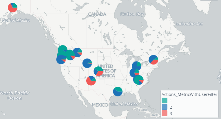
Add chart layer
You can add a special chart layer to the map to show pie charts or bar charts on the map. This chart pin layer is similar
to the trellis chart but shown on the map (similar to pins) and not on the plain dashboard.
- Create a map component. Navigate to and click Add new data. Select Chart layer.
- Configure the settings for your chart as usual. On the Time tab, the only difference is the Use shape settings check box: You can select it to apply shape settings. In this case, time settings are pulled from the component time settings.
- On the Display tab, you need to specify the location of pins and the breakdown under the Drill downs tab.
- Open the Presentation tab and select the display type for your charts. Currently, you can select either bars or pie charts. Also, set the Max scale (zoom level starting from which pins are shown), Pin height (in pixels), and Pin width (in pixels).
- Open the Series Settings tab to configure the conditional coloring like for any other metric component.
- Navigate to the Actions tab and add required actions.
- Click OK.