Finders
The finder is an important concept in Desktop Automation. A finder describes how to find an element you want to perform an action on. For example:
- If you want to open an application, the finder determines which device to do it on.
- If you want to click a button, the finder determines where to click.
- If you want to extract text, the finder determines where to look for the text.
Finders are created automatically when you insert an action step by right-clicking in the Recorder View. Design Studio attempts to construct a finder that reliably finds the element you intend to perform an action on.
If you insert a step directly, by clicking in the editor view, the finder is empty and you have to configure the finder to specify the target of the action.
You can always examine the finder used in a step by expanding the box labeled Device, Application, or Component.

Types of Finders
There are four main types of finders.
-
Device finder
-
Application finder
-
Component finder
-
Image finder
Each is increasingly more complex than the previous one and finds a more specific element.
- Device Finder
-
The simplest finder is the device finder. A device finder contains only a device selector that chooses between accessible devices.
The device selector is a drop-down list containing the names of devices that the robot can access. The devices are listed under Required Devices on the Action tab of the Call Desktop Automation Robot step.
The drop-down list also contains aliases of other finders. Choosing one of the aliases reuses the device selector from that finder.

The Device finder can be used, for example, in the Open to select the device where you want to open an application.
- Application Finder
-
The application finder at first selects a specific device and then a particular application on that device. The application finder requires a device selector and an application selector.
If the application finder is based on another application finder, it reuses the device selector and application selector of that finder.

If the application finder is based on a device finder, it reuses the device selector and you must provide the application selector.

The application selector uses CSS selector syntax as described in Selector Syntax.
When reusing an already found application, an internal handle to that application is used instead of performing the search among all applications again. This ensures that an application can be targeted correctly even when multiple new instances of the application are started with identical names.
The Application finder can be used in the Press Key to select an application that receives the key press.
Note On some configurations the application selector is ignored. For example, a key press is sent indiscriminately to the device and whatever application has focus (is in front) at the time receives the key press. In such cases you must ensure that the required application has focus when the action is performed. - Component Finder
-
The most common finder is the Component finder. Apart from selecting a specific device and application, the component selector finds a specific component within an application, such as an input field, a button, an icon, a table, or a menu.
The component finder is based on either of the following.
- A device
- A found application
- A found component
If the component finder is based on a device, you must provide an application selector and a component selector. If reusing an application, you need to provide only a component selector.
The component selector uses the same CSS selector syntax as described in Selector Syntax.
When reusing an already found component, an internal handle to that component is used instead of performing the search among all components again. This ensures that a component can be targeted correctly even if it changes position, and speeds up execution.
For finders reusing a component, there is an extra optional Inner Component field. This field can be used to find components within an already found component such as a cell within a table, or a button inside a modal dialog box.

The inner component selector also uses CSS selector syntax as described in Selector Syntax.
For all types of component finders, there is an optional Text Match (Regex) selector. It searches for matching text content among found components using the preceding selectors. The Text Match (Regex) selector is useful to distinguish between elements that vary only in the content they contain. For example, if a component selector finds both an OK and a Cancel button, the text selector can distinguish the text "Cancel" and target specifically the Cancel button. Text selectors are written using regular expression syntax.
 selector in a component finder")
- Image Finder
-
Some component finders have an additional image selector. These component finders are also called image finders.
You can use an image finder when the element you want to interact with is not readily found in the application tree, but it has a distinct graphical appearance.
Note The image finder is limited to 3000 matches per finder; a robot stops searching for a matching image after it finds 3000 instances.Image finders are not used by default, but they can replace the Component finder in any step that uses one. To use an image finder:
-
Drag a rectangular selection (marked in purple) in the Recorder view around the graphical element you want to find. You can modify the rectangle by dragging its sides, or just draw a new rectangle.
-
Insert a step by right-clicking inside the selection. The step should contain an image finder made from the selection.
The image selector in an image finder cannot be edited, but it can be replaced as described above in step 1.
You can remove the image selector, turning the image finder into a normal component finder, by removing the selection in the Image field.
The image selector has two forms: A simple image selector and a nine-grid selector (described in Nine-Grid Image Finder).

Important If you connect remotely to a Windows automated device via Remote Desktop Protocol (RDP), resolution and color depth depend on the network connection parameters between your computer and remote device. For example, different connection speed in different robot runs can lead to issues if robots use Image Finder and Intelligent Screen Automation (ISA). For Image Finder and ISA it is very important to always receive the same picture (pixel-by-pixel) in the same application state. Always use the same explicitly-specified resolution and color depth parameters (g: desktop geometry (WxH) and a: connection color depth) for the RDP connection in the Open step. For example:rdp://user1:MyPassword@MyDesktop?g=640x480&a=16
Note that another connection can alter the screen graphical parameters on the Desktop Automation service computer and therefore affect the Image Finder object.
-
Selector Syntax
The application and component selector use the syntax of CSS selectors, which provides a powerful way to specify which elements should be selected.
The general pattern of a selector is as follows:
elementName[attributeName="attributeValue"]
For example, to find the explorer.exe application window with the title "Documents," you would use the following pattern:
explorer.exe[title="Documents"]
Selector patterns can also be nested with the greater than sign (>) denoting a parent-child relation and a blank space denoting ancestor-descendant relation. For example, to find a button that is a child of a toolbar element that is somewhere among the descendants of a window element, you could use the following pattern:
window toolbar > button
- Advanced Selector Syntax
-
Kofax RPA supports most of the advanced selector syntaxes. The following table lists supported operators and how they work.
Pattern Meaning *
Any element
E
An element of type E
E[foo]
An E element with a "foo" attribute
E[foo="bar"]
An E element for which the "foo" attribute value is exactly equal to "bar"
E[foo~="bar"]
An E element for which the "foo" attribute value is a list of whitespace-separated values, one of which is exactly equal to "bar"
E[foo^="bar"]
An E element for which the "foo" attribute value begins exactly with the string "bar"
E[foo$="bar"]
An E element for which the "foo" attribute value ends exactly with the string "bar"
E[foo*="bar"]
An E element for which the "foo" attribute value contains the substring "bar"
E:root
An E element, at the root of the document
E:nth-child(n)
An E element, the nth child of its parent
E:nth-last-child(n)
An E element, the nth child of its parent, counting from the last one
E:nth-of-type(n)
An E element, the nth sibling of its type
E:nth-last-of-type(n)
An E element, the nth sibling of its type, counting from the last one
E:first-child
An E element, the first child of its parent
E:last-child
An E element, the last child of its parent
E:first-of-type
An E element, the first sibling of its type
E:last-of-type
An E element, the last sibling of its type
E F
An F element descendant of an E element
E > F
An F element child of an E element
E + F
An F element immediately preceded by an E element
E ~ F
An F element preceded by an E element
- Multiple Attributes
-
You can use multiple attributes in a selector with the pattern to uniquely identify an application window:
element[attribute1=”value1”][attribute2=”value2”][attribute3=”value3”]
For example, to find a button that has both visible=”true” and a name that begins with ”Save,” you can use:
button[visible=”true”][name^=”Save”]
Reusable Finders
Creating a reliable finder is important for the stability of the automation process. In some cases it can be challenging and involve manual modification of the selectors in the finder. Once you are satisfied with how a finder works, you can reuse it in many places.
Another reason for reuse is to ensure consistency. If many steps perform actions on the same element, it makes sense to have all the steps use the exact same finder. This ensures that there is no disagreement as to what the element is.
A finder can be reused three ways:
- Copy and paste a finder
- Reference the previous finder
- Reference the finder by name
- Copy and Paste a Finder
-
Copying and pasting a finder is the most fragile method of reuse. This method can be practical in situations when you want to create a finder but do not want to start with an empty finder.
To copy a finder, select the finder in the editor pane and either press Ctrl+C, or click the copy button
 on the toolbar.
To paste a copied finder, select the finder you want to overwrite and either press Ctrl+V or click the paste button
 on the toolbar.
- Reference the Previous Finder
-
The reference to the previous is the most useful and common way to reuse a finder. Such a reference is marked (previous) in the reuse drop-down list in the second field from the top of a finder. In this case, the current finder reuses the selectors of the most recently used finder.
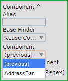
When a chain of finders use the previous finder, it means they all share the configuration of the first non-previous finder. Editing all the finders in the chain is performed by editing the first finder.
For most steps created from the Recorder view, the finders automatically contain references to the previous finder.
- Reference a Named Finder
-
References to named finders are useful when the finder you want to reuse is not the previous finder.
To name a finder so it can be reused, type a descriptive name into the Alias field (the first field from the top of a finder). Once you have one or more named finders, they appear as options on the reuse drop-down list for subsequent finders.
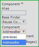
When a finder reuses another finder, it shares the configuration of that finder. Editing the named finder affects all the finders that reference it.
Nine-Grid Image Finder
Note that nine-grid image finder is being deprecated. You can use your robots with this finder, create new nine-grid image finders, but you cannot edit the finder in the editor pane. Kofax does not recommend using this finder, because it will be removed in one of the future releases.
Nine-grid image finder is a type of Image finder that can be used to find elements of different size in the Recorder View. You can use this finder primarily to find buttons or text fields. An element in this context is a sub image that is searched for when evaluating the image finder. When creating the finder, you can define up to nine elements to find. If a nine-grid finder is used for extraction, the central element is extracted. If the finder is used with the Move Mouse, the pointer is moved to the central element with regard to the offsets defined in the step.

In the image above, the striped cells are excluded from the finder evaluation.
- Prerequisites
-
-
You must define enough elements, so that the center element dimensions can be calculated, such as two diagonal corners or top and left side elements.
-
The included elements are searched for in a pixel-by-pixel manner with no relaxation on the match.
-
Each element must be at least 1x1 pixel in size.
-
- Add Nine-Grid Finder
-
To create a nine-grid image finder, drag a box in the Recorder View similarly to the image finder and click the image finder toggle button
 . Moving the bars inside the finder helps you change the elements in the nine-grid finder. You can
move a bar inside the finder using a mouse or by clicking it and using arrow keys. You can modify the rectangle by dragging its
sides or by drawing a new rectangle.
. Moving the bars inside the finder helps you change the elements in the nine-grid finder. You can
move a bar inside the finder using a mouse or by clicking it and using arrow keys. You can modify the rectangle by dragging its
sides or by drawing a new rectangle.
To include an element in the finder evaluation, right-click an element and select Include Cell When Finding. To exclude an element, right-click a cell and select Exclude Cell When Finding. You can also use Ctrl+Click to include and exclude elements. Included elements are transparent while excluded elements are striped with grey diagonal lines. Note that by default all corner elements are included in the nine-grid finder.
To return to the simple image finder, click the image finder toggle button again.
- Work with Nine-Grid Finder in the Workflow View
-
Once you add a step with a nine-grid finder, you should be able to see it in the editor view. The nine-grid finder only shows the included elements in the workflow view. The excluded elements are grey. Clicking an element in the finder toggles the inclusion state.

The image is scaled and clipped to better see the details of small elements and avoid showing huge images.
The following are samples of finders that locate one or more elements in the file list of Windows Explorer.
- Finding the first "edit" element that is a child of "list"
-
- Selector: ":nth-of-type"
- Finder: "list edit:nth-of-type(1)"

- Finding the second "edit" element that is a child of "list"
-
- Selector: ":nth-of-type"
- Finder: "list edit:nth-of-type(2)"

- Finding an "edit" element that is the second child
-
- Selector: ":nth-child"
- Finder: "list edit:nth-child(2)"

- Finding an "edit" element that is a descendant of "list"
-
- Selector: <space>
- Finder: "list edit"
- Finding a "list_item" element that is a child of "list"
-
- Selector: >
- Finder: "list > list_item"

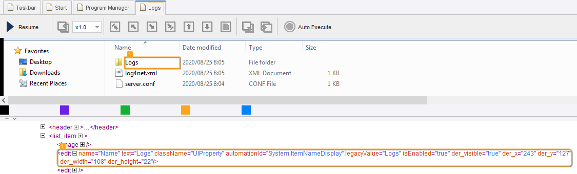
- Finding an "edit" element that has a "text" attribute with the "server.conf" value
-
- Selector: <attribute>
- Finder: "edit[text="server.conf"]"

- Finding an "edit" element located immediately after the element that has a "text" attribute with the "server.conf" value
-
- Selector: +
- Finder: "edit[text="server.conf"] + edit"

- Finding an "edit" element located anywhere after the element that has a "text" attribute with the "server.conf" value
-
- Selector: ~
- Finder: "edit[text="server.conf"] ~ edit"

- Finding the first "list" element anywhere
-
- Selector: ":first-child"
- Finder: "list:first-child"

- Use multiple attributes in finder
- In the following example, a finder with a conjunction of two attributes is used to click the Paste button in the
Windows Paint application.
The paste icon has the same name, but it does not have the isEnabled flag. Design Studio generates this finder for the Paste drop-down button.
- Application: mspaint.exe
- Finder: split_button[isEnabled="true"][name="Paste"]
