Use custom colors
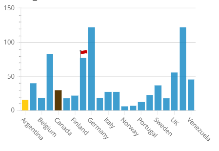
When you create charts, you can assign any custom color to a particular dimension or a data series. For example, you chart is broken down by ship countries and you can assign the yellow color to Argentina and the brown color to Canada.
-
In Studio, open the
Tools tab and select
Custom colors.

-
Click
Add and type the name of
the dimension (or the data series) in the
Title editable box. Use
the color palette to adjust the required color. Repeat this step as many times
as required.
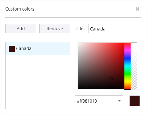
- Click OK to close the screen.