Multi-column support for fields
The usual "one line-one field" configuration can be changed to any proportional alignment with simple CSS modifications.
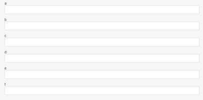
Usually, the fields in a form are listed in a way that each field has the same width and fills a complete line, as shown in Figure 1. This arrangement can be modified by specifying the width of each field and the gap between the fields, as shown in Figure 2.
Form with unspecified field width

Form with specified field width

The CSS modifications must be added to the Custom.css file as CSS variables under :root pseudo-class.
The field widths have to be specified in one of the following ways:
-
Variables:
--<name_of_the_field>-width: <any_valid_css_width>;
For example:
–-field1-width: 100%; --field2-width: 300px; --field3-width: 2em; -
Media queries:
For example:
@media(max-width: 480px) {
    :root {
        --a-width: 100%;
        --b-width: 100%;
        --c-width: 100%;
        --d-width: 100%;
        --e-width: 100%;
        --f-width: 100%;
    }
}
Where the field names are a, b, c, d, e, f respectively.
Field names with specified width must be referenced as CSS variable names in the Custom.css file, as shown in the examples. In case of multiple forms, all fields must have different names, otherwise the fields with the same name will have the same width in all forms.
The gap between the field can be specified the following way:
-
:root {
	--inside-padding: <any_width>;
}
For example:
:root {
	--inside-padding: 0.5rem;
}
The --inside-padding specification can also be placed under media queries, like any CSS variables, to specify different gaps on different screen resolutions.
